The small storefront is green — a soft, pastel shade you might get if you crossed a lime with a wintergreen Tic Tac. There are two large windows that sandwich a beat-up door with peeling paint; in them, round, oval, and ring-shaped loaves are stacked neatly below block letters announcing, on the left, “Italian bread & biscuits,” and on the right, “Vesuvio Bakery.” The facade is interrupted by an awning in a darker hue that reiterates the name of the bakery and bears its street number, 160, in a white font with little flourishes. A lone wooden chair stands out front, next to a freestanding figurine of a waitress with a serving tray.
The storefront could be a relic from another era — the face of a place that’s weathered unrelenting changes in the surrounding environment. It seems to represent something, a romantic image of the pre-internet past, when people bought their bread from a business down the block run by someone whose name they knew. From the vantage of 2019, it looks quaint and nostalgic, maybe even fictional, with a perfect coating of dirt and wear. It looks, you might say, like something out of a Wes Anderson movie.
In fact, Vesuvio Bakery was real: it operated in New York City’s Soho neighborhood from 1920 until 2009, after which it was taken over by another bakery, which has also since closed. Today, brown construction paper fills the windows, and a small sign on the door promises, “Coming back soon.” Meanwhile, the storefront is living another life online. In January 2018, a picture that the photographers James and Karla Murray took of it appeared on the hugely popular Instagram account Accidentally Wes Anderson (AWA), which acts as a kind of real-world lookbook for fans of the film director. AWA posted the image with a caption offering a bit of history about the bakery. It received 22,800 likes, as well as a comment from someone who said their great-grandparents had opened Vesuvio. “Thank you for posting this!” they wrote. “My mom loved seeing this and reading this caption today.”
To say that Wes Anderson has a style would perhaps be an understatement. “Sally forth and tally ho with director Wes Anderson, whose style is so specific, he’s basically his own genre,” says the narrator in the parody video “Every Wes Anderson Movie.” This distinction applies to the technical aspects of his films — including his fondness for symmetry and whip pans— but also to the handpicked sets, objects and costumes that fill them. Anderson’s movies are immediately recognizable because of what’s in them: Steve Zissou’s red beanie and Margot Tenenbaum’s oversize fur coat, Suzy’s trusty binoculars in Moonrise Kingdom, the pale pink Mendl’s bakery boxes that match the exterior of the Grand Budapest Hotel. The film and TV critic Matt Zoller Seitz, who authored the coffee-table book The Wes Anderson Collection, calls this “‘material synecdoche’ — showcasing objects, locations, or articles of clothing that define whole personalities, relationships, or conflicts.” In this way, Anderson’s accessories are both familiar and foreign, redolent of the world we live in but not quite of it. That’s what makes them so appealing.
On a more basic level, they also represent the director’s meticulous and comprehensive eye for detail and design. “He very much cares about everything that’s in every single frame,” says the fashion designer Fred Castleberry, whose made-to-measure clothing company F.E. Castleberry has a heavily Anderson-influenced aesthetic: in one lookbook photo from last year, a model stands outside that same Vesuvio Bakery, wearing what’s billed as a “red cashmere burglar cap” and carrying a hand-striped and monogrammed briefcase. “I’ve never seen a director incorporate so much of his personal experience and taste into the films that he makes. He knows what he wants, and if he can’t find it, he’ll make it.”
Indeed, Anderson is known for commissioning many of the costumes and props in his movies; as he told costume designer Karen Patch when they were working on The Royal Tenenbaums, “Don’t shop anything — make everything.” That fur coat Margot wears? Fendi made it, after a drawing by Anderson. Patch herself created the same character’s Lacoste dress before stamping it with the brand’s logo (with their approval). Incorporating drawings by Wes’s brother Eric, Marc Jacobs at Louis Vuitton designed the gaggle of suitcases and bags that the Whitman brothers comically lug across India in The Darjeeling Limited. Even the puppet star of Fantastic Mr. Fox wore a tailored corduroy suit (the director got himself one to match).
As Anderson has turned to fashion designers to help realize his visions, they’ve turned to him for inspiration, periodically filling the runways with variations on his characters’ looks. His films have arguably helped launch, or at least anticipated, trends in preppiness and tailored sportswear. Tony Bravo, a current arts and culture writer and former style reporter for the San Francisco Chronicle, pointed out that a shade of blue that predominates in The Life Aquatic was in vogue after the movie’s release. Bravo cautioned, however, that Anderson’s influence is a “chicken or the egg question: Is Wes following a lot of his generation’s design preferences and tendencies, or have there been a lot of people within the design world that are taking inspiration from him?” Bravo asks. “I think it’s a natural kind of blending and bleeding of these two things.”
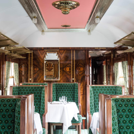
Whichever way they’re flowing, Anderson’s aesthetic currents now reach far beyond fashion. You can buy an array of Anderson-inspired products, including luggage and wallpaper. You can read blog posts that will tell you “how to decorate your home like a Wes Anderson film set” (number seven: add a record player). You can plan a Wes Anderson–themed wedding, or, if you want to be more subtle about it, study his color palettes to guide your design. You can even sip a latte and eat a slice of tiramisu at the Prada Foundation in Milan’s Bar Luce, which was designed by Anderson himself. While the director describes the cafe as “a space for real life” and a place where “I would want to spend my own non-fictional afternoons,” its quirky, retro vibe means you might also feel like an extra in one of his movies.
“I started to notice that everyone suddenly started to want to design their interiors to look like a Wes Anderson movie set,” says Anna Fell, a marketing executive at MuralsWallpaper. The company joined the craze earlier this year by designing and releasing a Wes Anderson collection of three different wallpaper prints: specimen-style butterflies, for Suzy from Moonrise Kingdom; pink paneling, for Agatha from The Grand Budapest Hotel; and tropical tigers, for Margot from The Royal Tenenbaums. It has been extremely popular.
“Getting people to think about their interior space differently” is part of that success, Fell explains. “How you can be more playful with it and get it looking like your dream space and how you would exactly want it to look, rather than just sticking with what’s already out there?”
This idea — of reenvisioning the quotidian as a site of personalization, an expression of one’s true self — is the ultimate Anderson ethos. It sums up his style better than any yellow-walled, tape player–and-taxidermy-filled room can. (“Rethink everyday objects,” notes the aforementioned “how to” listicle.) It’s also the guiding principle for Accidentally Wes Anderson, which Wally Koval started in June 2017, after being inspired by a thread on Reddit, and which has since garnered 849,000 followers (more than Ashley Judd but fewer than Kim Kardashian, for context).
As its name suggests, the account consists of photographs of places or scenes that look like they might appear in a Wes Anderson movie. The shots — taken by Wally and his wife, Amanda, as well as by submission from anyone — are mostly head on and symmetrical, featuring lots of color, old and opulent buildings, and quirky interiors. When you scroll through, the unifying effect is almost comical. The Kovals, however, write extended captions to identify what’s pictured and provide information about it, so that, as you click on different images, the mass of twee dissolves into distinct locations with real histories.
“I think it has to do with the perspective most of all,” says Wally. “We go to a lot of places that aren’t necessarily at first glance a perfect candidate for the aesthetic that you typically would see on our feed. But it doesn’t necessarily have to be about the subject itself. It has to be about looking at it through that slightly different lens. It’s almost like a curiosity to want to know more,” he adds.
Beyond simple aesthetic homage, that’s a sentiment Wes Anderson himself might appreciate. As Fred Castleberry, the fashion designer, puts it, the director takes his various influences — movies, music, elements of his own life — and “reframes them” in his films. “And the reframing is what’s interesting.” With Accidentally Wes Anderson, his style has become a new DIY filter — a reframing device for the rest of us to use, not just on images but on the world.
This article was featured in the InsideHook newsletter. Sign up now.

