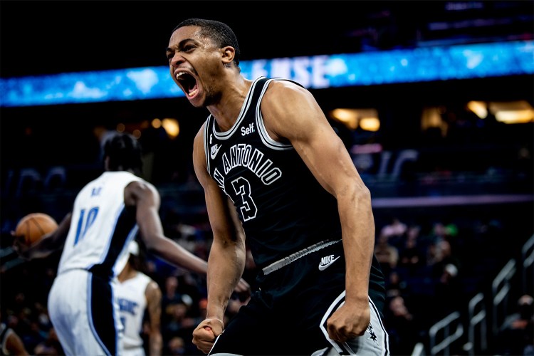
On Wednesday, Nike released the “City Edition” versions of each team’s uniforms. It is the fourth addition to the uni rotation, including Association, Icon, and Statement jerseys. The idea behind the “City Edition” jersey is that each represents the team’s locale, including architecture, history or anything else that might be reminiscent of the team’s hometown. According to The Ringer, a few of the jerseys are a hit. Others are a total miss.
Milwaukee did great, both with the colors and the design.
FIRST LOOK: Bucks’ new alternate uniform. Ad patch, although not shown in photo on right, will be worn on court. pic.twitter.com/GUSs5CQUeh
— Paul Lukas (@UniWatch) December 27, 2017
The Brooklyn Nets is pretty simple, maybe a little too simple, but you can see the resemblance to the Brooklyn Bridge.
Nets City Edition | For Brooklyn#WeGoHard #NikeXNBA pic.twitter.com/MltfHwakBt
— Brooklyn Nets (@BrooklynNets) December 27, 2017
The Detroit ones are just bad, especially because the Pistons’ main colors are much brighter than the navy and grey they chose.
Here is the new #Pistons Motor City jersey. pic.twitter.com/Th5ZdRR2L5
— Rod Beard (@detnewsRodBeard) December 27, 2017
Philadelphia’s is classy, but the font really ruins it.
FIRST LOOK: @sixers unveil “city” edition uniforms. pic.twitter.com/0PChP4YqM5
— Darren Rovell (@darrenrovell) December 27, 2017
And the D.C. jersey is just incredibly underwhelming.
Welcome to The District. Introducing the City Edition. #NIKExNBA #DCFamily pic.twitter.com/iISr77ZM04
— Washington Wizards (@WashWizards) December 27, 2017
Thanks for reading InsideHook. Sign up for our daily newsletter and be in the know.

